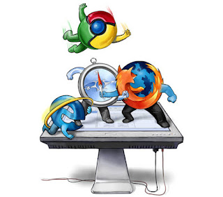
What browser do you use? Is it better than the others? Have you tried other browsers?
 As a frequent Internet browser, whether you use Desktop or mobile phone, one is always bound to use a specific browser. Everyone has certain opinions about their own preference. On this blog, I will not state which browser is the best because I don't want to start an arguement, but rather compare the interfaces of popular browser. So please, don't be offended. In this list, I will only mention the browsers I personally use, so I could not include the others.
Chrome’s most notable differences include a User button along the top (which only shows if you’re logged into a Google account) and the hamburger icon (three horizontal lines) which opens an actions menu that feels like a simplified File menu. The tabs meld into the title bar only when the browser in maximized.
Overall, a very clean experience. Unfortunately, like Edge, there isn’t much you can customize about Chrome’s appearance. You can install themes, but they change so little that they’re more like wallpapers than actual themes.
 The
The
The next one would be the browser I used before the Chrome. On the whole, Firefox has a softer aesthetic than the other browsers. That could be due to the default icon theme and/or the curvy-but-flat design of the tabs, but regardless, Firefox feels the most pleasant and comfortable to use right out of the box (at least for me).
But if you don’t like it, you can change it. Unlike the other browsers, Firefox supports two kinds of appearance customization: Themes, which are akin to basic wallpaper changes, and Complete Themes, which can change how the whole browser looks (e.g. tabs, colors, padding, positions of elements, etc).
In fact, there are Complete Themes that faithfully replicate the looks of browsers like Chrome and Opera, so if the interface is the only thing keeping you from using Firefox, you may want to reconsider.
 We continue this list with the browser I grew up with, Opera. Opera’s interface is closest to Edge: it’s tight, compact, with simple icons, not much wasted space, and lots of sharp, flat lines that make it feel clean and minimal. That being said, Opera is based on Chromium so Chrome users will find Opera to feel quite familiar.
Like Chrome, Opera has a single menu that acts like a simplified File menu, except instead of a hamburger icon, there’s a Menu button at the top left. It melds with the title bar when maximized, but otherwise takes up unnecessary space. This menu has everything you need to navigate the browser.
Theme-wise, Opera is severely lacking. You can install Themes, but these are literally nothing more than wallpapers for the Speed Dial page, so it’s possible that you’ll never even see them.
We will end this list with Microsoft Edge, the replacement of the of the internet Explorer. Sadly I never used Internet explorer because I grew up with Opera. So instead I replaced it with Microsoft Edge. Its interface is impressively slick and minimal, borrowing from the flat aesthetic guidelines that make Windows 10 so easily recognizable. There’s no menu bar or status bar. Only the bare essentials are shown and tabs are integrated into the title bar, maximizing screen space while browsing.
There aren’t any popup windows or dialogs either. Features and settings are accessed through sidebars that slide in and out from the right, a design decision that was likely influenced by the fact that many Edge users are on a tablet. That’s also probably why there aren’t any right-clicks in Edge.
There aren’t any popup windows or dialogs either. Features and settings are accessed through sidebars that slide in and out from the right, a design decision that was likely influenced by the fact that many Edge users are on a tablet. That’s also probably why there aren’t any right-clicks in Edge.

No comments:
Post a Comment