Laptop On The Top
In the corporate world, to get to the top, one must have the best laptop
 Let's talk about laptops. Aside from mobile phones, laptops are the next best thing when it comes to businesses on the go. It's portability and sleek design make it convenient to pack this mobile work-station everywhere you go. When it comes to business, efficiency and work-power is important that is why we're here to compare the specs of the 2 best laptops 2016 had to offer.
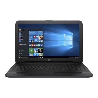
In terms of build and design, there is nothing significant to separate the HP 255 G5 from its 250 G5 cousin. The thickness and weight of both are similar at about 24 mm and 1.9 kg respectively.
Under the hood is where the main difference between the HP 255 G5 and 250 G5 can be noticed. This notebook is powered by A or E series Accelerated Processing Units (APUs) from AMD. The processors on offer are AMD A6-7410, A6-7310, and E2-7110 APUs. These are paired with AMD Radeon R5 Graphics, Radeon R4 Graphics, or Radeon R2 Graphics. You should experience enjoyable performance with these configurations, although you need to note this may not be the kind of laptop to push too hard. In terms of system memory, the HP 255 G5 comes with DDR3 RAM. It offers support for up to 8 GB, but it appears the memory won’t be upgradable by customers. For storage, the notebook can be configured with either a hard drive or a solid-state drive. Storage capacity goes up to 1 TB. The HP 255 G5 comes pre-installed with Windows 10 Home (64-bit), Windows 10 Pro (64-bit), Windows 7 Professional (64-bit), or FreeDOS 2.0. It features similar ports and slots as the HP 250 G5, including three USB ports. The HDMI v1.4b port supports up to Full HD (1080p) resolutions on external displays, while the VGA port supports up to 2,560 x 1,200 resolution. The affordable business laptop comes with HP Touchpoint Manager, firmware Trusted Platform Module and Intel Wireless Display support, amongst other features that would appeal to corporate users. Wi-Fi 802.11 a/b/g/n/ac and Bluetooth 4.0/4.2 are available for network connectivity. Entertainment is not left out of the package with the provision of HD Audio with DTS Studio Sound. The 255 G5 features HP TrueVision HD camera with HP Noise Cancellation. HP 255 G5 affordable laptops are not available on in Nigeria, Kenya, or Ghana. The HP 255 G5 price in Nigeria is expected to start at around 90,000 Naira, depending on your location and the configuration of the laptop.Price in Ghana is expected to start at around GH₵ 1100. HP 255 G5 price in Kenya starts at 25,999 KSh.
And on the other side we have the Dell XPS 13 Kaby Lake, a business ultraportable that punches above its weight.Believe it or not, Dell classifies the XPS 13 as a business laptop, albeit one that is geared towards a home office environment but businessmen (and women) will love the design. This ultraportable laptop – as Dell puts it – punches above its weight with Windows 10 Pro across the entire range as well as rather attractive pricing. This award winning laptop (it won best laptop of the year from us and many others) manages to pack a 13.3-inch display into the chassis of an average 11.6-inch model. The laptop can be upgraded to 16GB of RAM and a 1TB M2 SSD drive. Battery life is exceptional as well with almost 22 hours of continual use when using productivity applications.The screen is superb, although it's reflective, which is a bit of an annoyance. However, the tiny bezel somehow makes it feel more pleasant to work on than screens that sit inside a wide, dark frame. My review unit had a resolution of 3,200 by 1,800 pixels (276ppi) and delivered fantastic detailing. Lower-resolution FHD (1,920 x 1,080, 166ppi) screens are also available. The narrow upper bezel means the webcam has been relocated from the middle of the upper bezel to the bottom left corner of the screen, which has some usability consequences. When positioned in my normal typing position, in the middle of the laptop, I found my head sat slightly right of centre in the webcam image. It didn't take much manoeuvring to get my head central -- I just had to learn to sit off-centre when using the camera. The trackpad is wide enough to take the cursor right across the width of the screen in one sweep, and was nicely responsive. One of the star attractions of the 2016 Dell XPS 13 is Intel's 7th generation (Kaby Lake) processor, which should contribute towards battery life (see below). But don't expect to use this laptop for intensive graphics work: the GPU is upgraded to Intel HD Graphics 620, but, like other CPU-integrated graphics, it's no substitute for a dedicated graphics chipset. Our review sample ran a 2.7-3.5GHz Core i7-7500U with 8GB of RAM, and there are also Core i5 options in the lineup. Indeed, there are no fewer than 11 different configurations of the new XPS 13 available on Dell's UK website. One of the reasons for this is the option for a rose gold chassis. For example, my review unit most closely matched the model retailing for £1,329 (inc. VAT, or £1,107 ex. VAT). That model is identical to the £1,299 (inc. VAT, or £1,082 ex. VAT) version apart from its rose gold chassis colour -- it looks great, but does add a fair bit to the price. Compared to the £1,329 model, our review unit had the benefit of an upgrade from the Windows 10 Home to Windows 10 Pro. In fact, there are no Windows 10 Pro versions available off the page, although you can opt for Ubuntu Linux. SSD storage capacity across the 11 off-the-page configurations ranges from 128GB to 1TB; our review sample had 256GB.
Now that we had discuss a brief information about the specs, what's your opinion about it?
Sources: http://www.zdnet.com/product/dell-xps-13-2016-gold-edition/
http://www.techradar.com/news/mobile-computing/laptops/the-top-10-laptops-for-business-1090928
https://www.naijatechguide.com/2016/10/hp-255-g5-specs-price.html


